Australian Open streams using animation – but what did tennis fans think and how did it impact brands?
Sarah Melville - February 12th, 2025
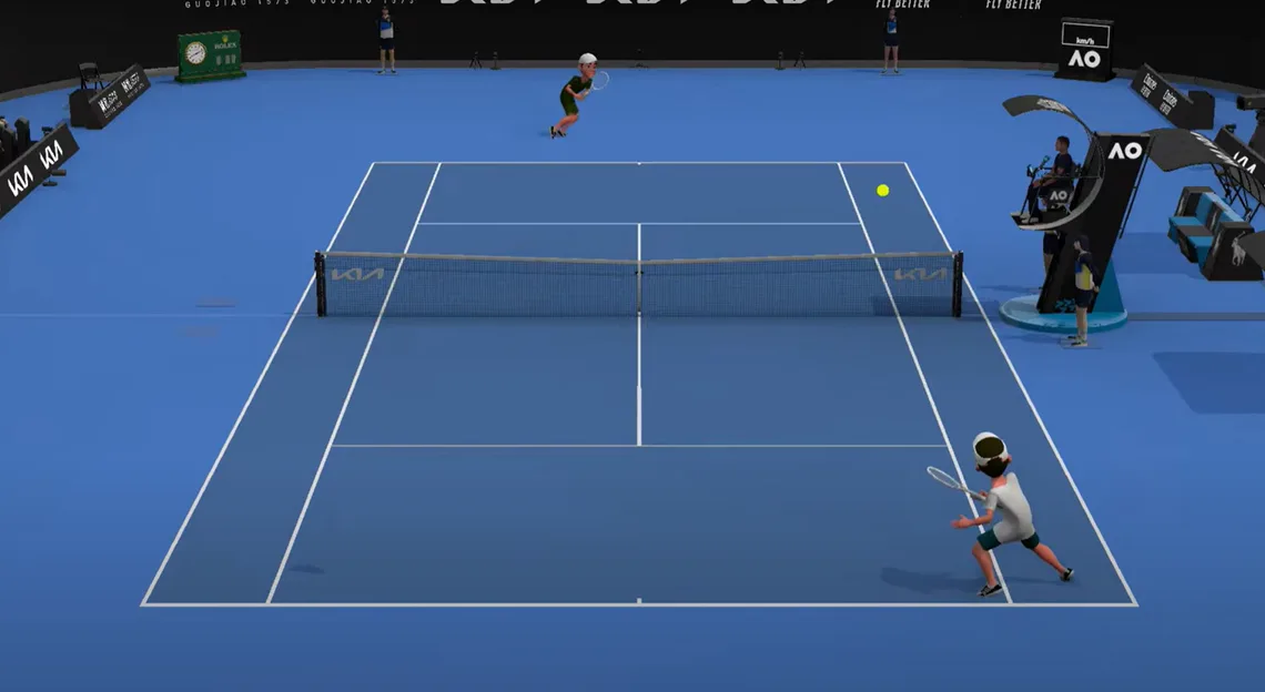
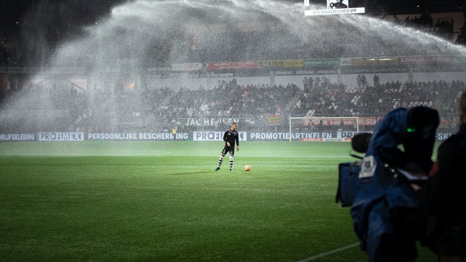
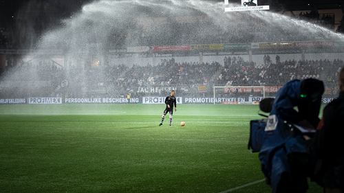
The Australian Open recently offered free-to-air livestreams on YouTube – with a catch. Instead of live footage of the actual match, the tournament used video game-style animated representations of each contest (in a style often compared to Nintendo’s WiiSports). You can see some of the stream here.
YouGov Surveys data can reveal that most British tennis fans weren’t aware of these livestreams. A fifth (19%) had heard at least something about the animated broadcasts, with four in five (81%) saying they had heard nothing at all of them. The awareness levels were higher locally, with nearly two fifths of Australian tennis fans surveyed (39%) having some awareness of the streams, and highest across the United States with almost half of tennis fans hearing about the streams (44%).
And when they did hear about it – after we showed them an image of one of the Australian Open’s animated matches – they largely did not like what they saw.
34% of Australian, 28% of American and 10% of British respondents positively viewed the style of animation as a way to watch tennis matches, while 38%, 47% and 72% respectively had a negative opinion of it.
British respondents were more critical of the animation than Australians, with 31% expressing strong dislike, compared to 14% of Australians and 20% of Americans. Interestingly, younger Australian tennis fans were more likely to appreciate the animation style, with 57% of 18-34 year-olds viewing it positively, compared to just 15% of those over 50. Some 54% of younger Americans took a positive view of the streams as well.
But the merits of this style are, to some extent, besides the point: if it’s not the ideal way to keep up with the Australian Open, it’s still a free way to stay up to date with the tournament. So we asked fans if they’d be interested in watching a free animated tennis broadcast in the absence of an alternative. Some 17% of British respondents said they’d watch it, 13% said they’d pay for a regular broadcast, and 61% said they would not watch it at all. In contrast, feedback from the United States and Australia was more positive, with 31% and 31% respectively willing to watch the animated broadcast, 16% and 14% willing to pay for regular coverage, and 41% in both countries preferring not to watch at all.
Across Britain, the United States, and Australia, younger fans aged 18-34 were more likely to opt for the free animated stream (26%, 48% and 50% respectively) compared to older tennis enthusiasts over 50 (12%, 18% and 15% respectively).
When we asked why they would choose not to watch animated tennis, some respondents said:
“I prefer to watch real people”
“Not to my taste”
“Animated says it all – it’s not real!”
“Animation belongs in films or cartoons, not sport”
“Animations are irritating to me”
“I want to see the actual players”
“It distracts from the skill of the real players”
Other themes that emerged focused on scepticism and distrust of the animated coverage, with respondents questioning the accuracy of the match-play representation. A few respondents expressed a general resistance to AI and technological advancements in sports broadcasting, fearing it might disrupt traditional human interactions and experiences, particularly the ability for fans to connect emotionally with the players.
The Australian Open’s experiment hasn’t particularly driven interest in animated tennis video games, either. Overall, 9% of Brits said they’d be more interested in playing titles such as Nintendo Switch Sports/Wii Sports or TopSpin; 25% said they’d be less interested; 63% said they were neither more nor less interested. Across the United States and Australia, the results trended a little more positively with 27% and 31% of tennis fan respondents noting that they’d be more interested in video games.
The pessimism surrounding the avatar version of the Australian Open extends to its impact on brand exposure. Focusing on the Women’s Final on January 25th, where Madison Keys defeated Aryna Sabalenka 6-3, 2-6, 7-5, the additional Avatar-esque live coverage attracted 233,000 global viewers. However, the value this brought to the brands present during the final did not match that of the 'real' footage.
While the additional YouTube viewers might seem impressive, they represented just 4.5% of the total reach across Australia, the UK, and the USA, and 7.4% of the total Net Sponsorship Value generated through the on-screen brands at the Women’s final. This underscores a strong consumer preference for the real footage over the animated version where available.
There were some positive outcomes, with brands like Chubb and Mastercard increasing their courtside exposure from 7 and 18 minutes respectively to 1 hour and 25 minutes and 1 hour and 13 minutes due to the additional coverage. However, through use of YouGov’s bespoke Image Recognition System ‘Theia’, it’s noted that overall, the animated coverage did not provide brands with the same level of impact as the real footage.
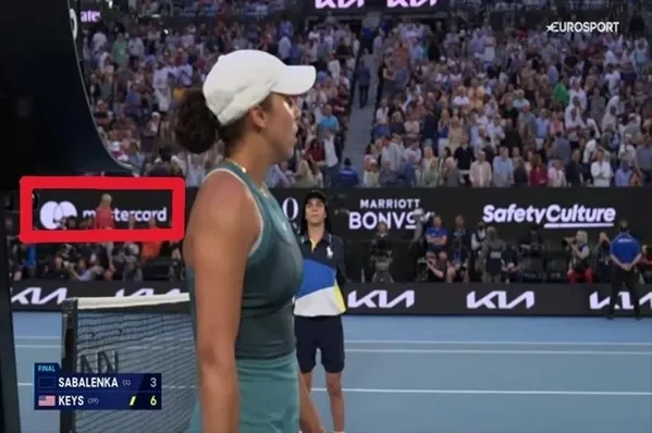
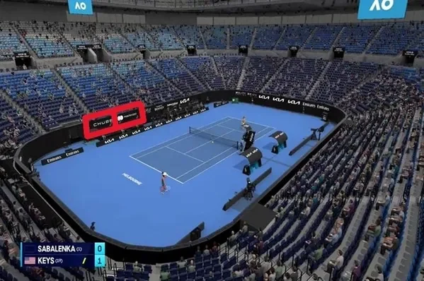
The upper image is captured from the ‘real’ broadcast coverage, showing how Chubb is not visible, and Mastercard is blocked by passing spectators. These issues were not present in the animated coverage shown in the image below, which displays Chubb and Mastercard branding across the court side
The main areas of missed opportunity in the animated footage are related to camera angles and image quality. A slight zoom-in significantly reduced the visibility of the Kia brand. Additionally, three brands—Google Pixel, Marriott Bonvoy, and Pirelli—had their rotational screen graphics overlaid onto the court surface during the main broadcast, but these were not captured at all in the animated coverage.
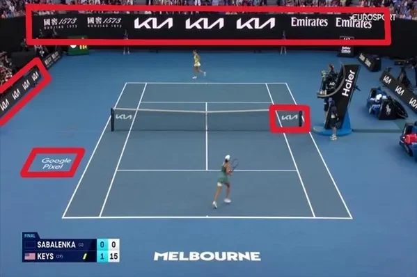
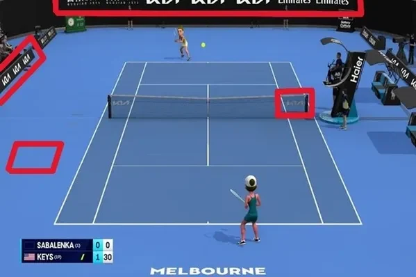
The image of the animated coverage cuts off the Kia and Emirates Court End branding and lacks the Court Surface branding seen in the 'real' footage image (Google Pixel) below. The Kia Net Branding is also much crisper in the real coverage compared to the blurring seen in the animated feed.
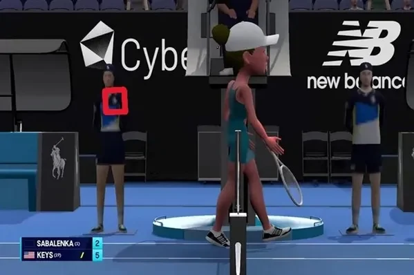

This blurring issue is also evident in the Ball Kid uniforms, which did not generate any Ralph Lauren brand exposure value in the animated footage due to a lack of clarity, a problem not present in the official tennis match feed.
While these differences may seem subtle to the human eye, their impact on brand exposure is significant. The animated footage received 24% fewer brand hits across all monitored brands, and these hits garnered a 10% lower Brand Impact Score^ compared to the official footage (1.99 vs. 2.20 out of a possible 5.00).
While the viewership, public opinion and brand impact of the animated footage may not have rivalled that of the mainstream coverage, it's important to note that the alternative live stream generated an additional £1.27 million in Net Sponsorship Value across the 17 brands we monitored during the Women’s final match. Notably, Chubb, Mastercard, and Safety Culture brand partners saw increases of 86%, 37%, and 13% in Net Sponsorship Value, respectively, compared to the value achieved through the official coverage in Australia, the United States, and the United Kingdom and hence a worthwhile opportunity.
Given that the YouTube streams appealed to younger fans, it may be worth continuing this offering in the future, but certainly not at the expense of more traditional broadcast options.
Make smarter business decisions with better intelligence. Understand exactly what your audience is thinking by leveraging our panel of 27 million+ members. Speak with us today.
YouGov polled 1,004 British tennis fans, 1003 US tennis fans, and 721 Australian tennis fans online in January/February 2025. The survey was carried out through YouGov Surveys: Self-serve. Data is weighted by age, gender, education level, region, and social grade. Learn more about YouGov Surveys: Self-serve.
^Brand Impact Score represents a collective assessment of a brand’s onscreen impact. It calculates how long the brand was on the screen, its size, how many other brands were present, it’s centrality when on screen and how many iterations of the brand there was. The maximum score is 5.00. Check out our website for more information.
Image credit: Tennis Australia
Related Content
ARTICLE
25 days ago
Female athletes are growing their games
ARTICLE
about 1 month ago
NRL Player Jersey Names
ARTICLE
about 2 months ago
Did Aussies watch sporting events at home, in person, or at the pub in 2024?
ARTICLE
about 2 months ago
Did Americans watch sporting events at home, in person, or at the bar in 2024?

ARTICLE
4 months ago
Will AI Make Its Way Into NFL Play Calling? [Op-ed]

ARTICLE
9 months ago
How are viewers planning to follow the Paris Olympics?
ARTICLE
about 1 year ago
Is the middle-overs slump in ODI cricket a real thing?

ARTICLE
over 1 year ago
FIFA Women’s World Cup 2023: Gauging passion in key participating markets
ARTICLE
over 1 year ago
Bairstow dismissal unfair say Brits, but do they feel the laws of the game need to change?
ARTICLE
almost 2 years ago
What’s it worth to sponsor Ted Lasso’s fictional AFC Richmond?
ARTICLE
almost 2 years ago
Inter Miami reaches all-time Buzz high amid Lionel Messi news;

ARTICLE
almost 2 years ago
Lionesses Fan Profile: An audience that is more open to brands’ social messages
ARTICLE
almost 2 years ago
Nearly half of urban Indians claim they have subscribed to a streaming platform for sports content
ARTICLE
almost 2 years ago
UAE has the highest proportion of consumers across the globe who engage with sports
ARTICLE
almost 2 years ago
Three in ten Australian adults have subscribed to a streaming platform to watch sports content
ARTICLE
almost 2 years ago
Manchester City, Juventus top football Buzz Movers chart for March 2023
ARTICLE
almost 2 years ago
The impact of pursuing CSR goals on sports and brand perception in Britain

ARTICLE
almost 2 years ago
Formula 1 – An always-on global sports event
ARTICLE
about 2 years ago
US – Inside the mindset of March Madness fans: Who they are, how they gamble and more
ARTICLE
about 2 years ago
Serving Pickleball – understanding demographics and key behaviours
ARTICLE
about 2 years ago
Where do sports need to invest in and focus on heading into the future?
ARTICLE
about 2 years ago
Could F1 put Saudi Arabia tourism on the fast lane?
ARTICLE
about 2 years ago
UK: Who is the GOAT men’s footballer?
ARTICLE
about 2 years ago
Two-thirds of Man United fans oppose an Elon Musk takeover

ARTICLE
about 2 years ago
Football fans: No, Haaland hasn’t made Man City worse

ARTICLE
about 2 years ago
Football fans think Man City broke the rules, but don’t expect them to face serious punishment

ARTICLE
about 2 years ago
Premier League half-time: Half of fans expect Arsenal to win – and Everton to get relegated
ARTICLE
about 2 years ago
Where is the Six Nations most popular? And how do its fans mirror those of F1?

ARTICLE
over 2 years ago
FIFA World Cup in Qatar: Fans say the new approach to stoppage time has worked well

ARTICLE
over 2 years ago
FIFA World Cup in Qatar: Fans say the new approach to stoppage time has worked well

ARTICLE
over 2 years ago
Have the World Cup sponsors made an impression?

ARTICLE
over 2 years ago
Sports industry trends and insights roundup 2022

ARTICLE
over 2 years ago
Mexicans know European teams are better. They just don’t follow them

ARTICLE
over 2 years ago
Gamer attitudes towards the FIFA World Cup 2022

ARTICLE
over 2 years ago
Booking.com hits it out of the park with T20 World Cup fans