How likely is likely?
YouGov explores people’s perceptions of probabilities
In mid-August US polling aggregator FiveThirtyEight launched their new model predicting the outcome of the 2020 US presidential election. The results showed that Democratic candidate Joe Biden had a 71% chance of victory, to Donald Trump’s 29%.
The results were, by happenstance, exactly the same as they were for Trump vs Clinton four years ago. The fact that Trump won the 2016 presidential election was, to many armchair pollsters, proof that the model was wrong, despite the fact that it was a very real possibility under the numbers cited – a Trump victory was in fact slightly more likely than the possibility of flipping a coin twice and getting heads both times.
This highlights the need to figure out how to describe the likelihood of certain events to people in a way that gives them a realistic sense of what might happen. For their part, FiveThirtyEight are experimenting with new ways of framing the data: couching the model results as how many times a candidate won in 100 different simulations, and describing Biden as being “favoured” to win.
What impression might such descriptions give readers? A new YouGov survey data looks at how Britons perceive probability.
Likely is, on average, 6.65 out of 10
We put a list of 16 words to Britons and asked them to tell us on a scale of 0-10 how likely or unlikely they believed an occurrence described in such a way was to happen.
“Very unlikely” scored lowest of the terms we asked about, being rated on average 2.38 out of 10. At the other end of the scale was “almost certain”, which scored a perhaps surprisingly low figure of 7.98.
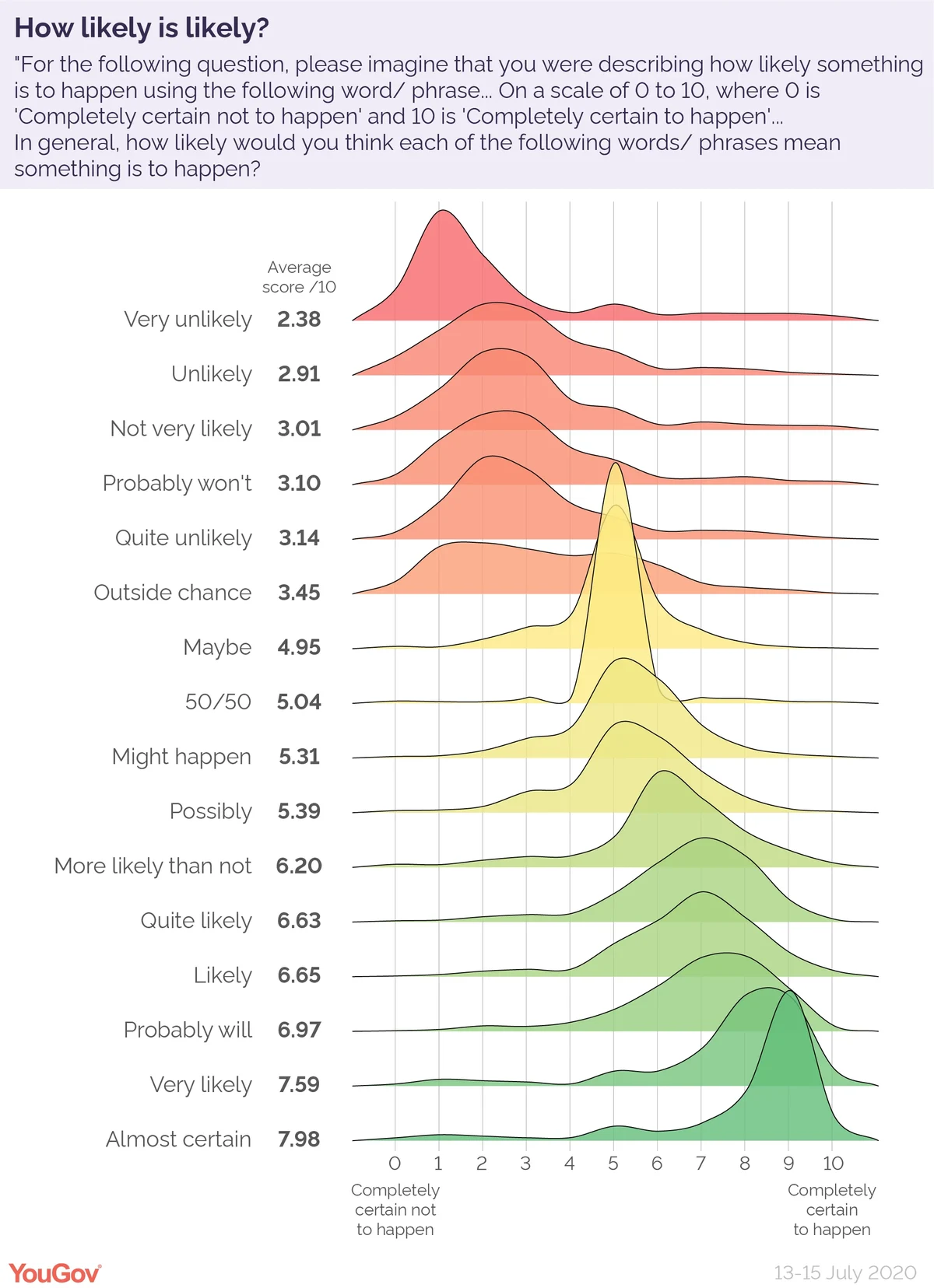
Slap in the middle is “50/50”, scoring 5.04 on average. Of those who gave a response on this question, fully 84% scored the term 5 out of ten 10.
Almost exactly as close to the centre point was the term “maybe”, at 4.95. Despite being such a similar score, understanding of the meaning of “maybe” is substantively different to “50/50”. Just half (50%) of respondents gave a 5/10 score to the term, with people much more likely to score it 4/10 (12%) or 6/10 (16%) than they were for “50/50”.
But perceptions of likelihood differ depending on how you ask the question
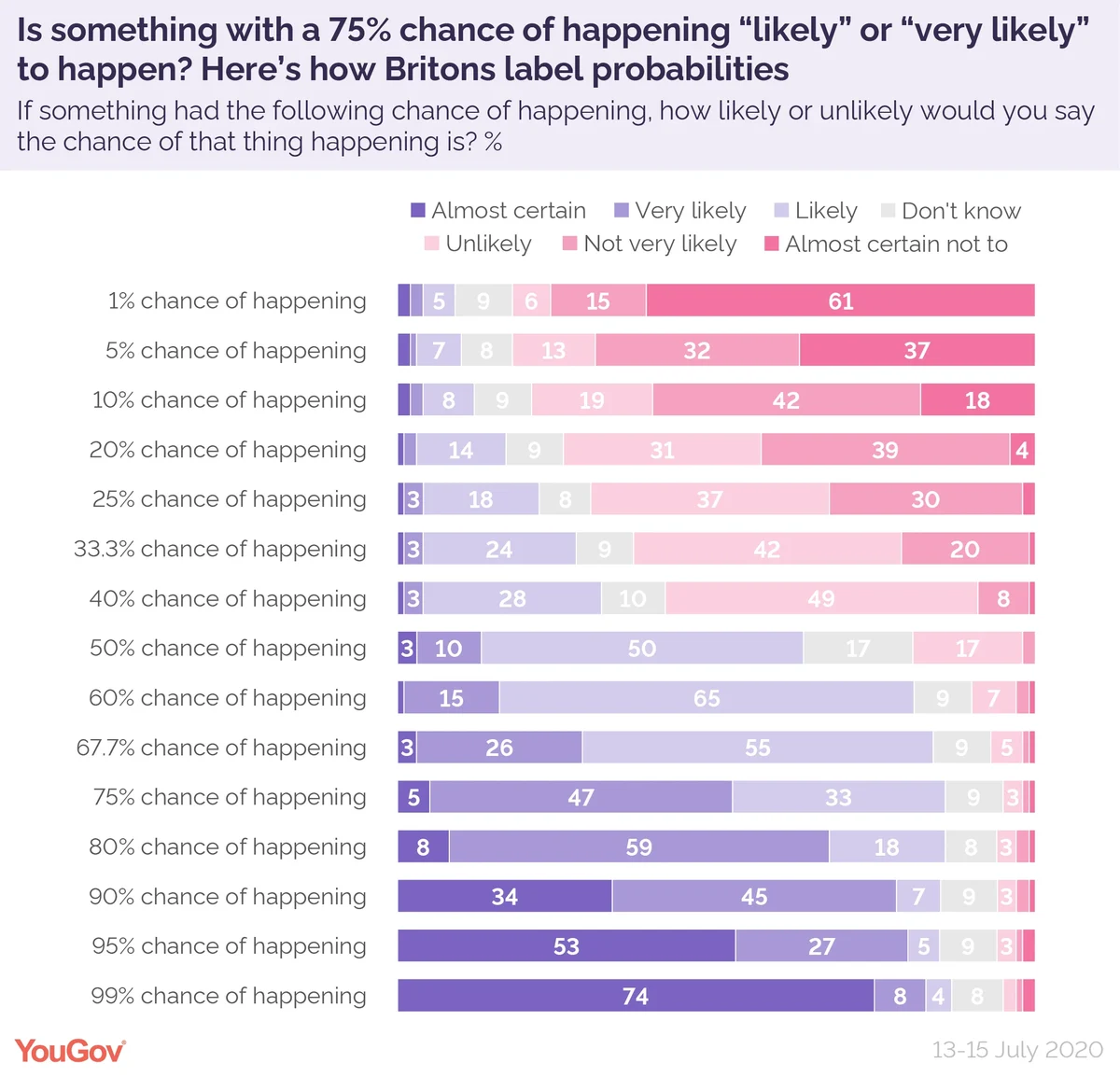
We also came at the same question from the opposite direction: giving people a list of probabilities and asking them to choose the most appropriate description for them.
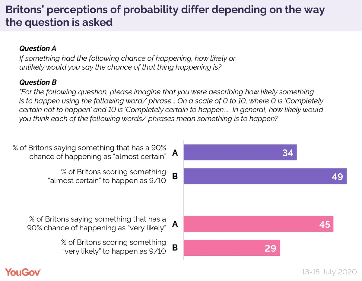
The different methodology does show significantly different results. For example, in the first question when we asked people to describe “very likely”, 29% gave it a score of 9/10. However, when we asked people how likely something with a 90% chance of happening was, 45% said it was “very likely”.
One in three (34%) felt the better description for something with a 90% chance of happening was “almost certain”. Yet when asked to score “almost certain” out of 10, almost half (49%) said 9/10.
Also notable is how people responded when asked about a chance with a 50% chance of happening. Exactly half (50%) described such an occurrence as “likely” to happen – yet only 17% labelled it “unlikely”, despite semantically both terms being equally applicable to the odds involved.
At what point do people become convinced a prediction was wrong?
The study also sought to examine the kind of response the FiveThirtyEight model received by looking at how people respond to low-probability predictions coming to pass.
To simulate the conditions under which people reacted to the FiveThirtyEight model, but without doing so in a way that could lead to political biases, we asked respondents what they made of predictions by a hypothetical sports analytics firm about the outcome of a tennis match.
Respondents were asked whether, in the event that a low-probability prediction came to pass, they believed that this indicated that the sports analytics firm’s prediction model was wrong.
The answer depends on quite how unlikely that event was to take place. For instance, in the event that a player with a predicted 49% chance of winning ended up victorious, 42% of respondents said they would think “That the model was correct, and this was just an unlikely outcome that happened to take place”. A further 21% said that to them this proved “That the model was incorrect, and this outcome was more likely to happen than they had said it was”.
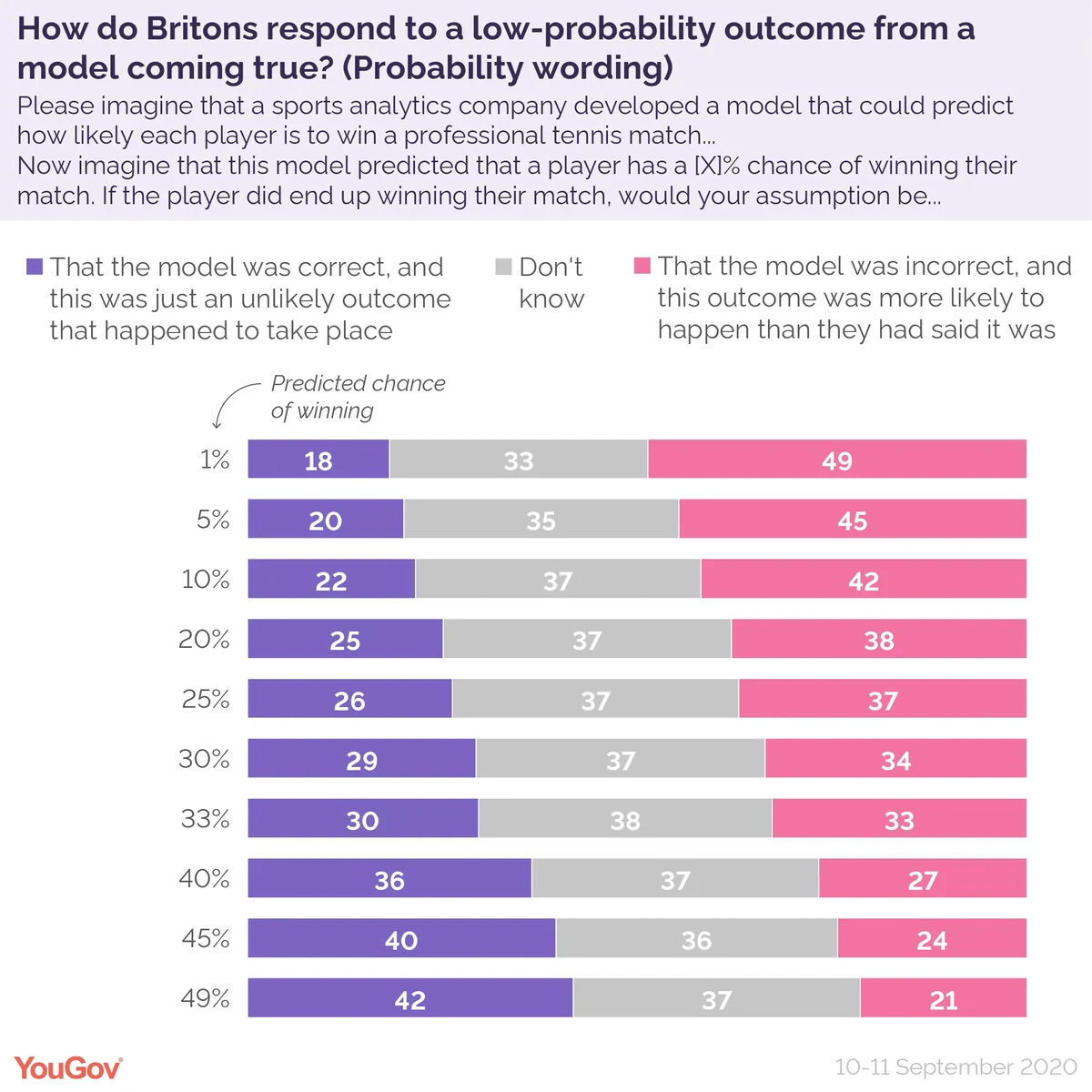
At the other end of the scale, should a tennis player with an only 1% chance of winning their match end up taking the prize, 49% of people would think this meant the model was wrong, and only 18% think this could mean the model was still correct.
As mentioned above, the predicted odds of Trump winning the presidency in 2016 were 29%. The results of our survey indicate that about 29% of Britons would think a model predicting such an outcome was right, while 34% would think it was wrong.
The results also highlight a very high rate of “don’t know” responses, generally about 37%. This highlights how tricky a subject this is for people to grasp: generally speaking a survey about current affairs would see about 20% don’t know responses, so this rate is almost twice as high.
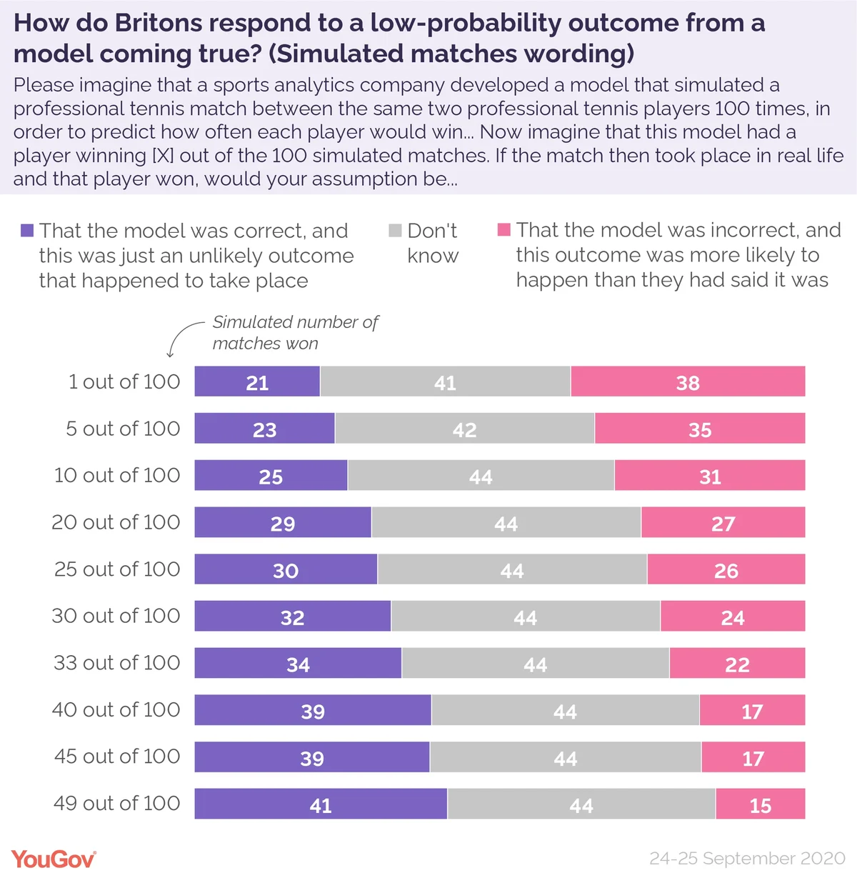
We also asked a separate variation of the question where we framed the question in terms of X of 100 simulated games being won (to attempt to emulate the way FiveThirtyEight are showing users a sample of 100 simulated outcomes in their explanations of the results to readers). The overall results are broadly similar, with the main impact being to push up the proportion of “don’t know” responses.
The rather unsatisfying conclusion of all this is that people’s perceptions of probability are varied and complex, and that it is hard to point at a way to communicate them in a way that everyone would understand or accept. As YouGov itself knows from election polling, people tend to focus only on the headline outcome, eschewing warnings of margin of error and other such caveats.
Whether FiveThirtyEight’s efforts to communicate the issue more clearly help remains to be seen – and of course are not comparable if Trump does not win this time round! But until someone can find the right way to explain probability to the average voter, the polling industry will continue to be hostage to fortune.
See the results here, here and here
Photo: Matemateca (IME/USP)/Rodrigo Tetsuo Argenton